
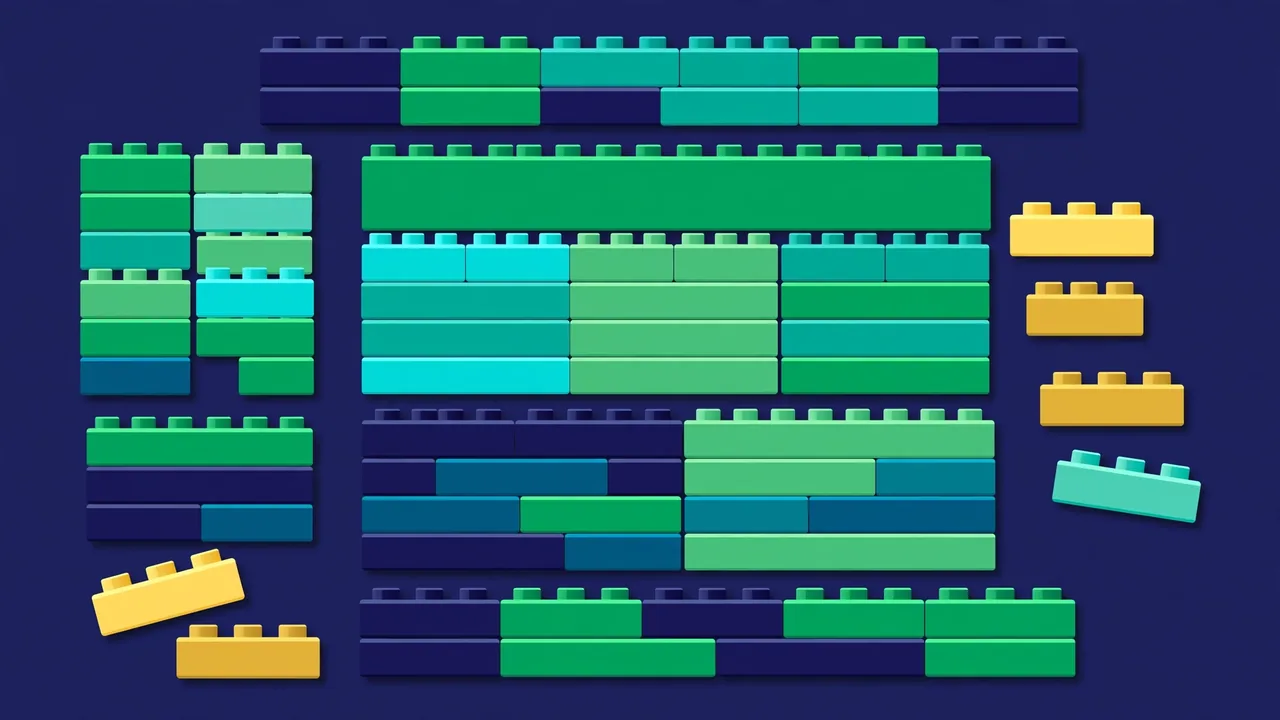
The WordPress block editor changed how content is built — from one big text box into modular blocks you can move, style, and reuse. If you learned WordPress on the old classic editor, or if you have been using blocks timidly (paragraphs and the occasional image), this guide will take you from hesitant to fluent. We will cover the blocks that matter, the patterns that multiply your speed, reusable content, full-site editing, and the pitfalls that trap every beginner.
Thinking in Blocks
The core mental shift: everything on the page is a block. A paragraph is a block. A heading is a block. An image, a button, a quote, a list, a video embed — all blocks. Each block has its own settings in the right-hand sidebar, which means formatting is contextual instead of global. Select a paragraph block and you get text controls; select an image block and you get alignment, size, and alt text.
This matters because it ends the old war with the editor. In the classic editor, centering one image could reformat your whole post, and pasting from a word processor imported a swamp of invisible formatting. In the block editor, changes stay inside the block you selected, and pasted content converts into clean blocks you can fix individually. Once you internalize that — select the block, then look at the sidebar — the editor stops fighting you.
Learn the keyboard shortcut for adding blocks: type / (forward slash) on a new line and start typing the block name. “/image”, “/heading”, “/button” — it is dramatically faster than clicking the inserter, and it is the single habit that separates block editor beginners from fluent users. Pair it with list view (the stacked-lines icon in the top toolbar), which shows your page as an outline: you can select nested blocks that are hard to click, drag to reorder, and see the document structure at a glance.
The Blocks Worth Mastering First
You do not need all of them. These cover the large majority of real publishing work:
- Paragraph and Heading: the foundation. Use real heading levels (H2, H3) in logical order — it structures your content for readers, screen readers, and search engines. Never skip levels for styling reasons; style is CSS’s job.
- Image and Gallery: images with proper alt text, captions, and alignment. The gallery block handles multi-image layouts without plugins, and the image block’s focal point picker controls cropping on responsive sizes.
- List and Quote: structured content that readers scan. Quotes with citations for testimonials and pull-quotes; lists for anything sequential or grouped.
- Buttons: calls to action. Style them once via your theme and reuse — consistent buttons convert better than improvised ones, and readers learn what “the button” looks like on your site.
- Columns: the layout workhorse. Two- or three-column rows for features, comparisons, and side-by-side content. On mobile they stack automatically — always check the stacked order makes sense.
- Group: the most underrated block. It wraps other blocks so you can style, move, and space them as one unit. Most “how do I…” layout questions are answered by “put it in a Group block.” Background colors, padding, and borders applied to a group create designed sections from plain blocks.
- Embed: paste a video or social URL on its own line and WordPress converts it automatically. No embed codes, no iframes to manage, and the preview renders right in the editor.
- Table: for real tabular data — pricing comparisons, specifications, schedules. Keep tables simple; complex merged-cell layouts belong in a dedicated table solution, not in a post.
Master these eight before exploring the rest. Fluency with fundamentals beats shallow familiarity with forty blocks you use once a year.
Patterns: Layouts You Don’t Have to Rebuild
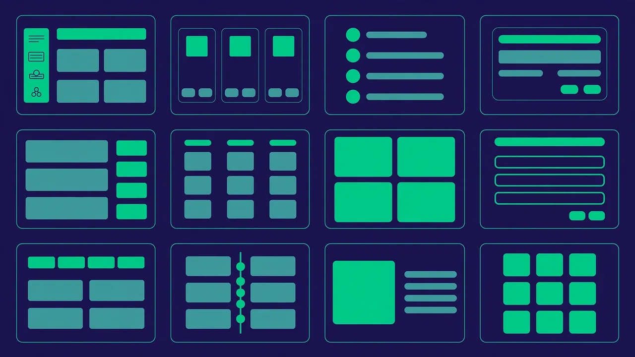
Patterns are pre-designed arrangements of blocks — a hero section, a pricing table, a testimonial row, a call-to-action banner. Instead of building the same layout from scratch every time, you insert the pattern and swap in your content. WordPress ships with a pattern library, and block themes include their own collections matched to the theme’s design.
The professional move is building your own pattern library. Every time you design a section you like — an author bio box, a feature grid, a newsletter signup, a verdict box for reviews — save it as a pattern. Within weeks you will have a private toolkit that makes new pages take minutes instead of hours, and every page will look consistently on-brand because it is literally built from the same pieces. To save one: select the blocks, open the options menu (three dots), and choose to create a pattern. Give it a clear name and category so future you can find it — “CTA / Newsletter dark” beats “My pattern 3.”
Patterns come in two flavors. Synced patterns stay linked: edit the original and every instance across your site updates. Perfect for disclaimers, signup boxes, and anything that must stay identical everywhere. Unsynced patterns are starting templates: insert, then customize each copy freely. Rule of thumb: if all copies must always match, sync it; if each copy will evolve independently, don’t.
Reusable Content Without the Copy-Paste
Beyond patterns, the editor gives you two more tools against duplication. Template parts (headers, footers, sidebars as block constructs) let site-wide regions be edited once. And for content authors, the humble copy-and-paste between posts got smarter: copying blocks preserves their full structure and styling, so a well-built section can travel from an old post to a new one intact.
The discipline that makes all of this work is single-source thinking: before duplicating content, ask whether it should be synced. Prices, dates, legal notices, contact details — anything that changes — should exist in exactly one place and be referenced everywhere else. The hour you spend converting scattered copies into synced patterns pays for itself the first time a price changes and you update it once instead of hunting through forty posts.
Full-Site Editing: When You’re Ready
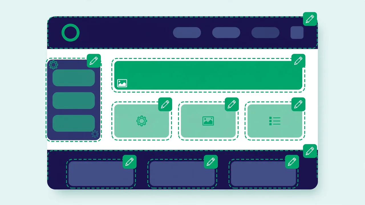
Full-site editing extends blocks beyond post content to the entire site — headers, footers, templates, and template parts — edited visually in the Site Editor (Appearance → Editor). Instead of PHP templates, your theme’s layout becomes blocks you can rearrange: move the post title above the featured image, restyle the header, redesign the 404 page, build a custom archive layout, all without code.
You only get the full Site Editor with a block theme. Classic themes still use the Customizer and PHP templates, and if you are on a classic theme and happy, there is no urgency to switch — it remains a fully supported way to run WordPress. But if you are choosing a new theme and want maximum visual control without code, a block theme with full-site editing is the modern path. Start small: edit one template part (like the footer) before redesigning whole templates, and always preview template changes across post types and pages, because templates apply site-wide and a change that looks great on posts might break your landing pages.
One caution: with great power comes great ability to make a mess. Template edits affect every page using that template. Before restructuring a template, duplicate your approach on a test — many site editors let you preview, and a staging site lets you experiment freely. And keep notes on what you changed; six months later, “why does the archive look like that” should have an answer.
Avoiding the Classic Block Editor Pitfalls
Every beginner hits the same traps. Knowing them in advance saves hours:
- The invisible nested block. You click a column and cannot select the paragraph inside it. Solution: list view. It shows the hierarchy and lets you click-select anything, no matter how deeply nested.
- Formatting that will not go away. Pasted text brings hidden formatting. Select it and use the “clear formatting” option in the toolbar, or paste as plain text to begin with.
- Full-width blocks breaking the layout. Wide and full-width alignments interact with your theme’s content width. If a block looks broken, check its alignment setting first — switching back to default width fixes most cases.
- Mobile surprises. Columns stack on mobile, but the stacking order follows the source order, which is not always the visual order you want. Preview at phone width and reorder blocks in list view if needed.
- Over-designing with blocks. Just because you can nest six groups with custom colors does not mean you should. The best-looking block-built pages are usually the simplest. Restraint is a feature.
Editor Settings That Make Life Easier
A few configuration choices compound over time. In the editor’s preferences (three-dot menu → Preferences), enable spotlight mode if you get distracted — it dims everything except the block you are editing. Keep list view open while building complex layouts. Set your default image sizes and link behavior thoughtfully so you are not adjusting them on every image.
If you publish similar posts repeatedly, create a template draft: a post containing your standard structure (intro, key-points pattern, heading skeleton, CTA pattern) saved as a pattern and inserted at the start of each new draft. It enforces consistency without any enforcement effort, and it is especially valuable if multiple people write for the site — everyone starts from the same structure.
Pro tip: the block editor autosaves, but it does not protect you from yourself. Before restructuring a long post, duplicate it as a draft backup. Ten seconds of caution beats an hour of reconstruction.
The block editor rewards fluency in a specific order: slash commands, list view, core blocks, transforms, patterns, synced content, and eventually full-site editing. Learn them in that sequence, build your own pattern library as you go, dodge the classic pitfalls, and within a month you will produce better-looking pages in less time — which is the entire point of the tool.