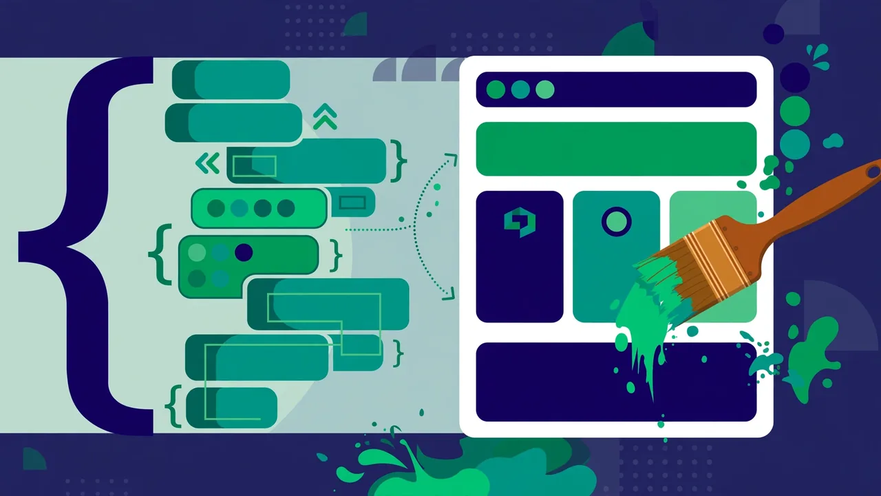
You do not need to “learn CSS” to use CSS. You need a safe place to put it — the Additional CSS panel in the Customizer (Appearance → Customize → Additional CSS) — and a set of recipes you understand well enough to adapt. Every recipe below is copy-paste ready, and each includes a plain-English explanation of what it does so you can tweak it with confidence instead of superstition. Work through them in order: typography and spacing first (biggest visual payoff), then buttons, images, and mobile fixes.
How to Use These Recipes Safely
Paste one recipe at a time into Additional CSS and watch the live preview update. If something looks wrong, delete what you just pasted — the panel is non-destructive and every change is previewed before publishing, so your live site is never at risk while you experiment. CSS you add here is stored in the database, which means it survives theme updates, unlike edits made directly to theme files. That single property makes Additional CSS the correct home for all small style tweaks.
One rule: never paste CSS you do not roughly understand into your live site. These recipes are explained line by line precisely so you always know what each declaration does. A quick primer on the syntax you will see: a selector (like h2 or .button) says what to style, and the declarations inside the curly braces say how to style it. A period before a name means it targets a class; without a period it targets an HTML element type. Once that clicks, every recipe below becomes readable.
Typography: Take Control of Text
Typography is where amateur sites reveal themselves. Most themes ship with acceptable but generic text styling, and a few targeted tweaks produce a disproportionate improvement — readers may not consciously notice good typography, but they absolutely feel bad typography as “something looks off.”
Recipe 1 — Larger, roomier body text:
body { font-size: 18px; line-height: 1.7; } — sets base text to 18 pixels with generous spacing between lines. Readability improves instantly on most themes that ship with cramped 15–16px text. If 18px feels too large on your theme, try 17px; the principle matters more than the number — give text room to breathe.
Recipe 2 — Tighter, bolder headings:
h1, h2, h3 { letter-spacing: -0.02em; line-height: 1.2; } — pulls heading letters slightly closer together and tightens line spacing. This is the subtle detail that makes headings look professionally typeset instead of default. The negative letter-spacing (called “tracking” in print) is a hallmark of modern editorial design; use it sparingly and only on headings, never body text.
Recipe 3 — Style link underlines your way:
a { text-decoration-thickness: 2px; text-underline-offset: 3px; } — makes link underlines thicker and pushes them slightly away from the text baseline. Small change, noticeably more polished links. Increase the offset further for an airier feel, or drop thickness to 1px for subtlety.
Recipe 4 — Elegant blockquotes:
blockquote { border-left: 4px solid #1a7a4a; padding-left: 1.25rem; font-style: italic; } — gives quotes a colored accent bar and comfortable indentation. Swap the color code for your brand color to make quotes feel native to your design.
Buttons: Make Them Yours
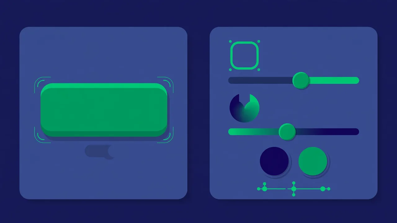
Buttons are your conversion machinery — every signup, purchase, and contact action flows through one. Default theme buttons are functional but forgettable. These recipes make them feel intentional, which quietly increases the likelihood visitors actually click them.
Recipe 5 — Pill-shaped buttons:
.wp-block-button__link { border-radius: 999px; padding: 14px 32px; } — rounds button corners fully and adds comfortable padding. Targets the standard WordPress button block. The oversized radius value (999px) is a common trick: any value larger than half the button height produces a perfect pill regardless of the button’s actual size.
Recipe 6 — Buttons with depth on hover:
.wp-block-button__link { transition: transform 0.2s ease, box-shadow 0.2s ease; } .wp-block-button__link:hover { transform: translateY(-2px); box-shadow: 0 8px 20px rgba(0,0,0,0.15); } — the first rule makes all changes smooth instead of instant; the hover rule lifts the button two pixels and adds a soft shadow. That tiny micro-interaction is a large part of what “feels premium” on modern sites. Keep the movement subtle — more than a few pixels starts to feel gimmicky.
Recipe 7 — Full-width buttons on mobile:
@media (max-width: 600px) { .wp-block-button__link { display: block; width: 100%; text-align: center; } } — on phones, buttons stretch full width and are easy to tap with a thumb. The @media wrapper means this rule only applies on screens narrower than 600px; desktop buttons are untouched. Full-width mobile buttons are one of the highest-impact mobile conversion tweaks you can make.
Spacing: The Secret of Good Design
Ask designers what separates professional layouts from amateur ones and most will say spacing — specifically, the discipline of consistent vertical rhythm. These recipes install that discipline in minutes.
Recipe 8 — More air between sections:
.entry-content > * + * { margin-top: 1.75rem; } — adds consistent breathing room between content blocks. The selector reads as “every direct child of the content area that follows another child” — in plain terms, even spacing between all your blocks. If your pages feel cramped, this single rule often fixes them. Adjust 1.75rem up or down to taste; the key is that it is consistent.
Recipe 9 — Remove the gap under the header:
.site-header { margin-bottom: 0; } .entry-content { padding-top: 0; } — when your theme leaves an awkward gap between the header and the page content, this closes it. Selector names vary by theme, so use your browser’s inspect tool to find your theme’s actual class names and swap them in. This recipe is as much a lesson as a fix: learning to identify the right selector is the skill behind all CSS customization.
Recipe 10 — Limit line length for readability:
.entry-content p { max-width: 68ch; } — caps paragraph width at 68 characters. Long lines tire eyes because the return sweep to the next line gets harder; this is the single most effective readability fix for text-heavy sites, and the ch unit (width of the “0” character) keeps it proportional to your font.
Images: Polish the Visuals
Recipe 11 — Soft rounded images:
.wp-block-image img { border-radius: 12px; } — gently rounds image corners site-wide for a softer, more modern feel. Change 12px to 50% for fully circular images (works best on square images, like avatars and team photos).
Recipe 12 — Subtle image zoom on hover:
.wp-block-image { overflow: hidden; } .wp-block-image img { transition: transform 0.4s ease; } .wp-block-image:hover img { transform: scale(1.04); } — images ease 4% larger when hovered, a refined gallery-style effect. The overflow rule is essential: it keeps the zoom inside the image frame instead of letting the enlarged image spill over neighboring content. The slow 0.4s transition is what makes it feel luxurious rather than jumpy.
Mobile Fixes: The Recipes You’ll Use Most

More than half of web traffic is mobile, yet most CSS tweaking happens on desktops. These four recipes fix the mobile problems that appear on nearly every site.
Recipe 13 — Stop headings from breaking mobile layouts:
@media (max-width: 600px) { h1 { font-size: 2rem; } h2 { font-size: 1.6rem; } } — desktop-sized headings often overflow or dominate phone screens. This scales the two biggest levels down on small screens while leaving everything else intact.
Recipe 14 — Kill horizontal scrolling:
img, iframe, table { max-width: 100%; } — wide embeds are the usual culprit when a page scrolls sideways on mobile, which is one of the most annoying mobile experiences possible. This constrains them to the screen width. If a specific embed still misbehaves, wrap it in a Group block and apply the rule to the group.
Recipe 15 — Comfortable tap targets and conditional hiding:
@media (max-width: 600px) { nav a, .menu a { padding: 12px 16px; } .hide-on-mobile { display: none; } } — two fixes in one: enlarges menu link hit areas for thumbs, and hides anything tagged with the “hide-on-mobile” class (add it via the block’s Advanced → Additional CSS Classes field). Decorative images, wide tables, and secondary widgets are typical candidates for mobile hiding. Less on a small screen is almost always more.
Troubleshooting: When Recipes Misbehave
Three situations cover nearly all “it didn’t work” cases. First, wrong selectors: theme class names differ, so a recipe targeting .entry-content does nothing if your theme uses .post-content. Right-click the element, choose Inspect, read the actual classes, and adapt. Second, specificity wars: if your rule seems ignored, the theme’s own rule may be winning. Make your selector more specific (add a parent, e.g. .entry-content p instead of p) rather than reaching for !important, which creates maintenance headaches. Third, caching: if changes do not appear, hard-refresh (Ctrl/Cmd + Shift + R) and clear any caching plugin — stale CSS caches are the number one phantom cause of “CSS doesn’t work.”
Pro tip: keep your Additional CSS organized with comment lines like /* — Buttons — */ between groups. Six months from now, organized CSS is editable CSS; a wall of uncommented rules is archaeology.
Fifteen recipes, zero risk, and every one explained. Start with the typography and spacing fixes — they deliver the most visible improvement per line of code — then work through buttons, images, and mobile fixes. Within an hour your site will look noticeably more considered, and you will have learned enough CSS by osmosis to start writing your own.